
The Problem
The current App Portal lacks a user-friendly home page that clearly explains the process of creating apps and listing services. Users are often confused about the difference between Services and App Listings, as this has not been properly addressed. Important technical details, such as how to use Keka APIs and manage the sandbox environment, are missing or difficult to find. Without proper guidance, users may struggle to start, navigate, and complete the steps needed to create and publish their apps or services. Additionally, there is a need to offer a personalized home page experience based on different user roles or personas to better guide them through the process.
What did I do?
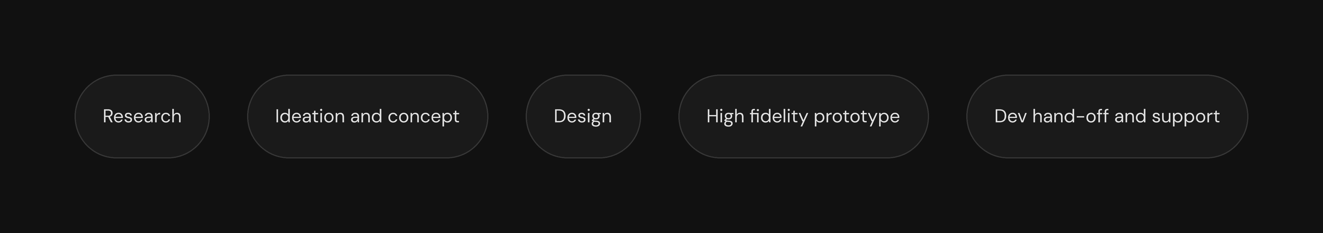

Timeline
This was one of the fastest features we've worked on. Internal discussions, ideation, concept development, design, usability testing, leadership feedback, and developer hand-off were all completed within just 2 weeks.

To begin, I had an in-depth discussion with the Product team about the need for a homepage and its benefits. We also talked about the different personas who would be using this product. Our main personas are admins, developers, and marketers from the integration partner group.

After the discussion, we analyzed our direct competitors to understand how they’ve approached similar challenges. We looked at their features, user flows, and overall design to see what works well and what could be improved. This helped us identify key insights that we can apply to our own design, ensuring we meet user needs and stand out in the market.
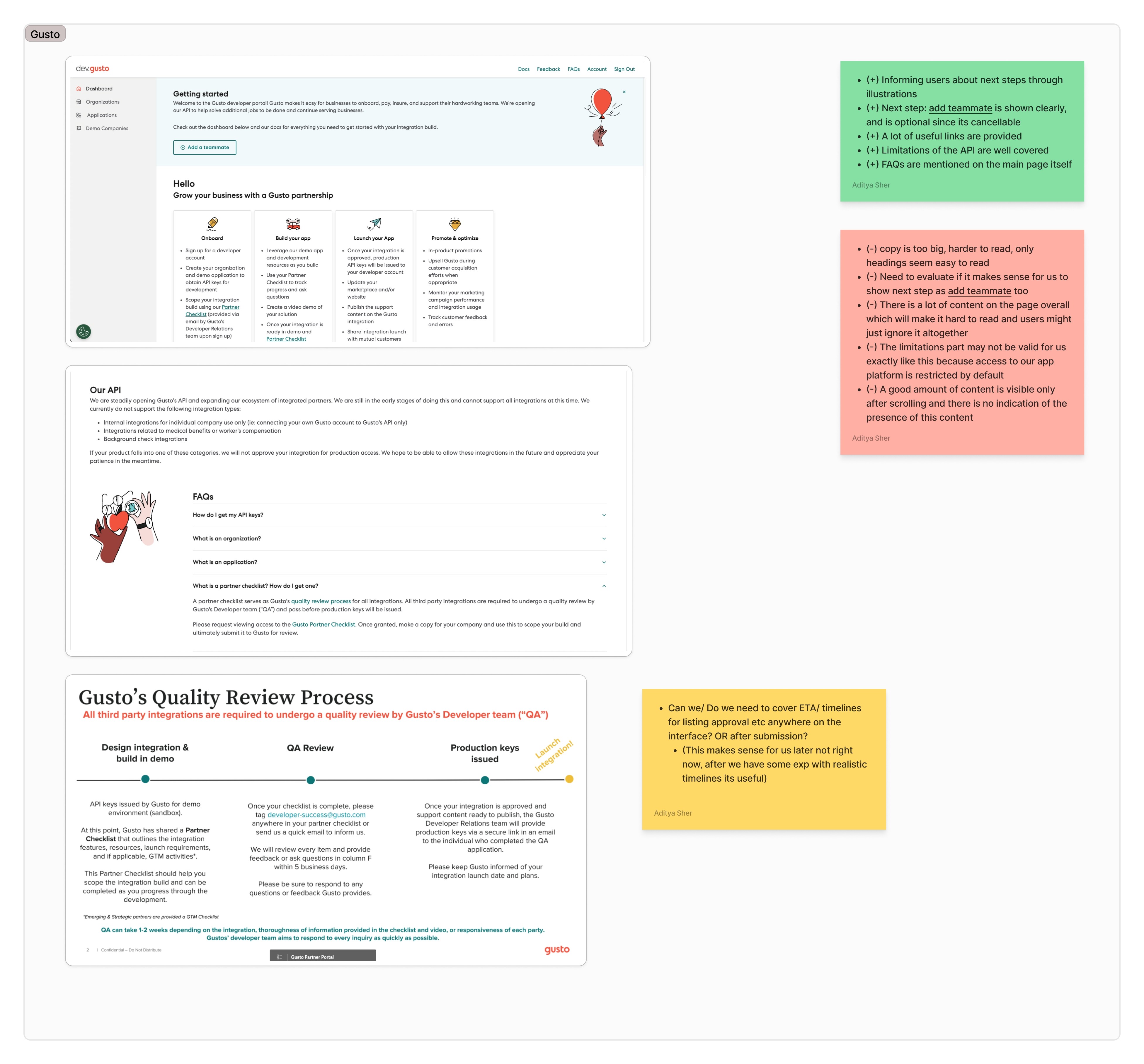

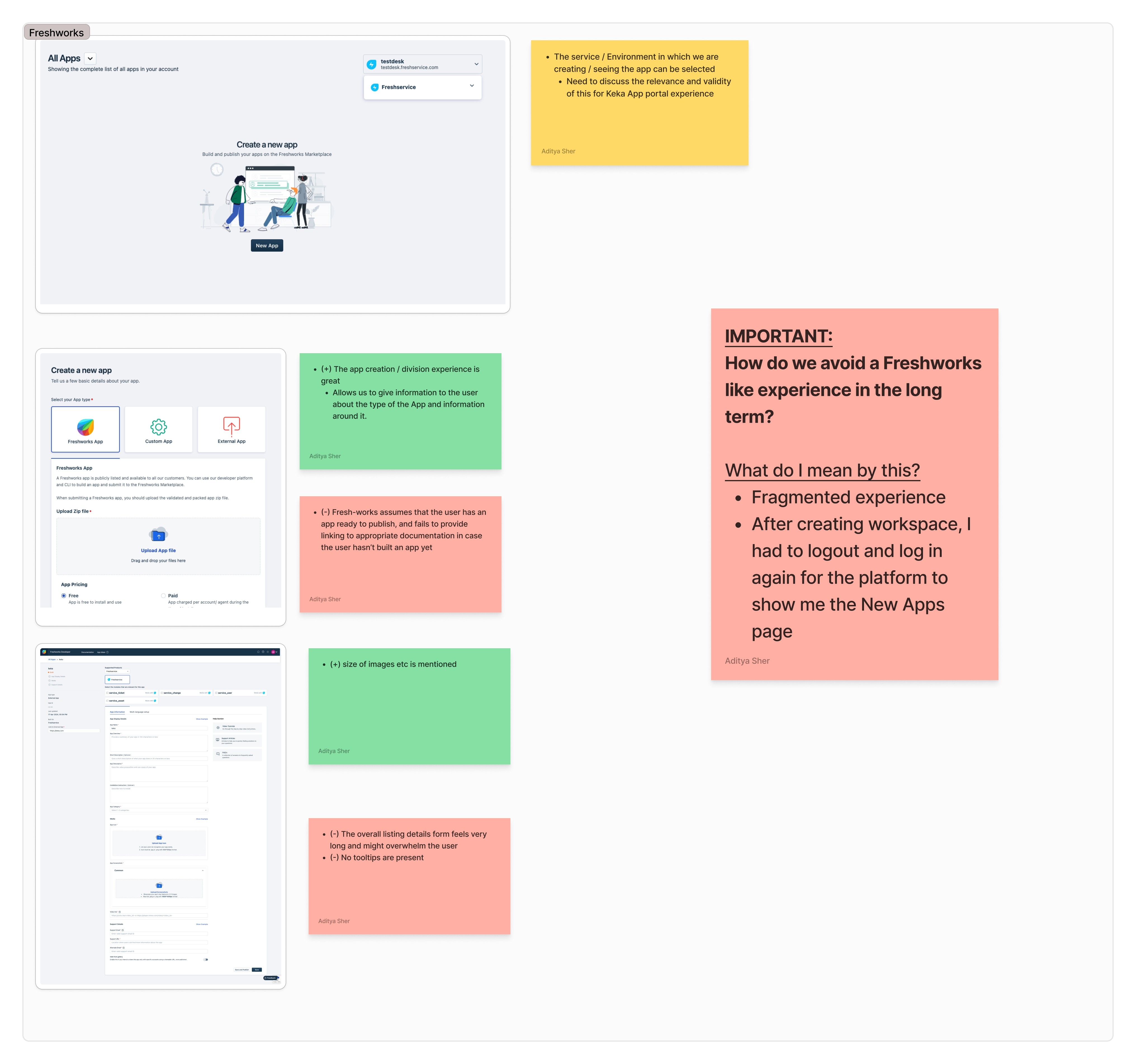


We spent two days analyzing all the competitors, identifying the strengths and areas for improvement in their user experience. Based on these insights, we discussed our findings with internal stakeholders and leadership. Their feedback helped guide us as we started organizing and structuring the information for our design.

With the insights we’ve gathered, we’re ready to move forward with designing the experience. The next step is to carefully consider how we should organize and present the content on the homepage, taking into account the needs and priorities of each persona. This will help us ensure the experience is tailored and relevant, providing clear guidance for admins, developers, and marketers as they navigate through the platform.
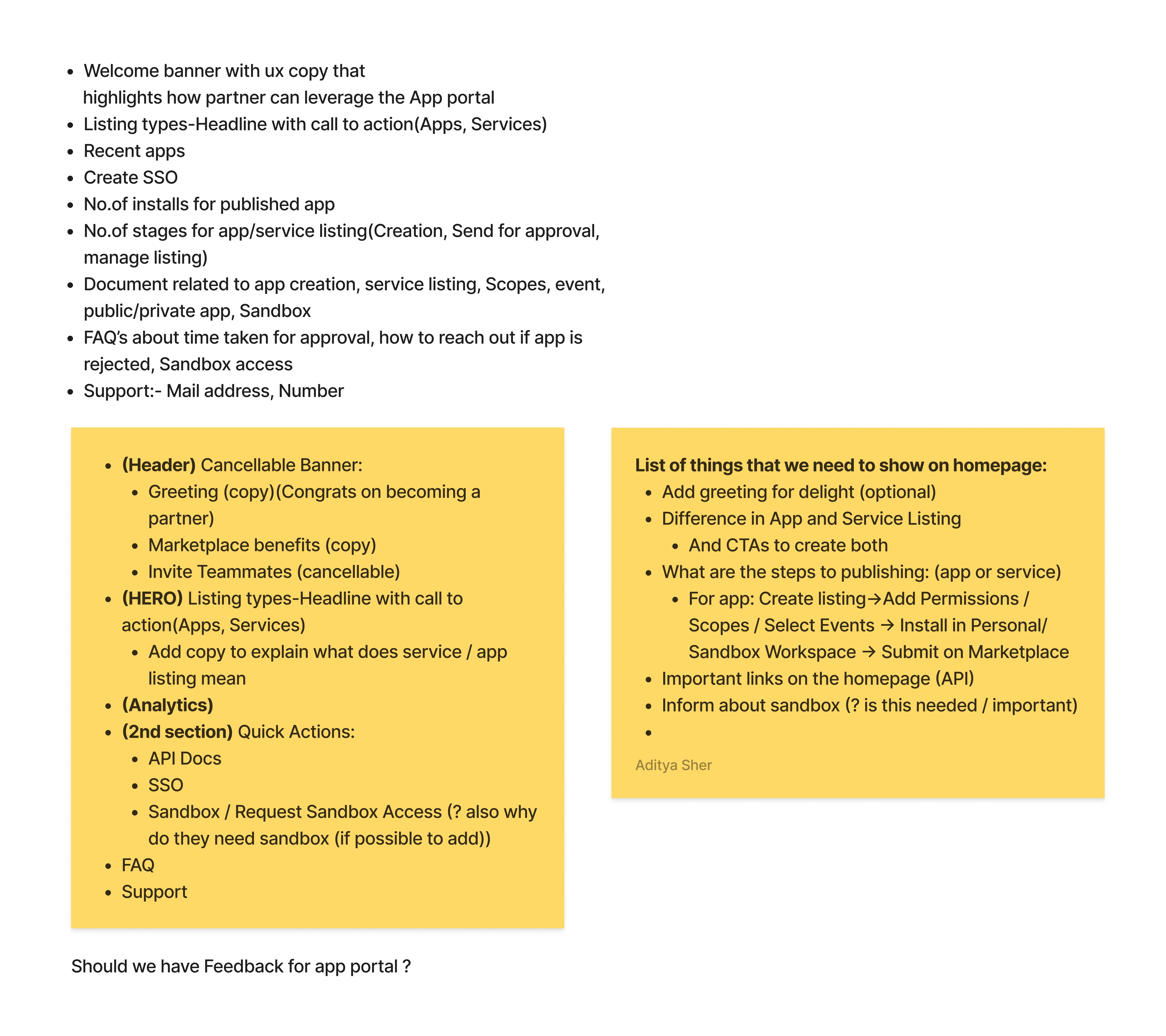
After finalizing the content to be displayed on the homepage, we moved on to creating rough wireframes to visualize the layout and flow. These wireframes were designed to showcase how the content would be arranged for different personas and to ensure the user experience is intuitive. We then presented the wireframes to leadership for their feedback, aiming to refine the design and ensure alignment with the overall vision and goals.

Getting into Visuals
Based on an analysis of competitor products and multiple internal brainstorming and whiteboard sessions with the Product and Development teams, I have designed a homepage offering a personalised experience.
Presenting
The App Portal homepage⚡️

My goal while designing the homepage experience was to make it clear, intuitive, and seamless. I wanted users to quickly understand its purpose, easily find what they need, and take action without confusion.
The design ensures that users can:
✅ Understand the homepage at a glance
✅ Explore guides on creating an app/service if needed
✅ Access quick actions effortlessly
By focusing on clarity and ease of use, the homepage helps users navigate smoothly and get things done with minimal effort.
Solution Video
Note: Sorry for the video quality 😕
Breaking down the component
We’ve carefully considered every possible scenario to ensure the experience is helpful for both first-time users and existing users. Every design decision is aimed at making the journey smoother and more intuitive for everyone.
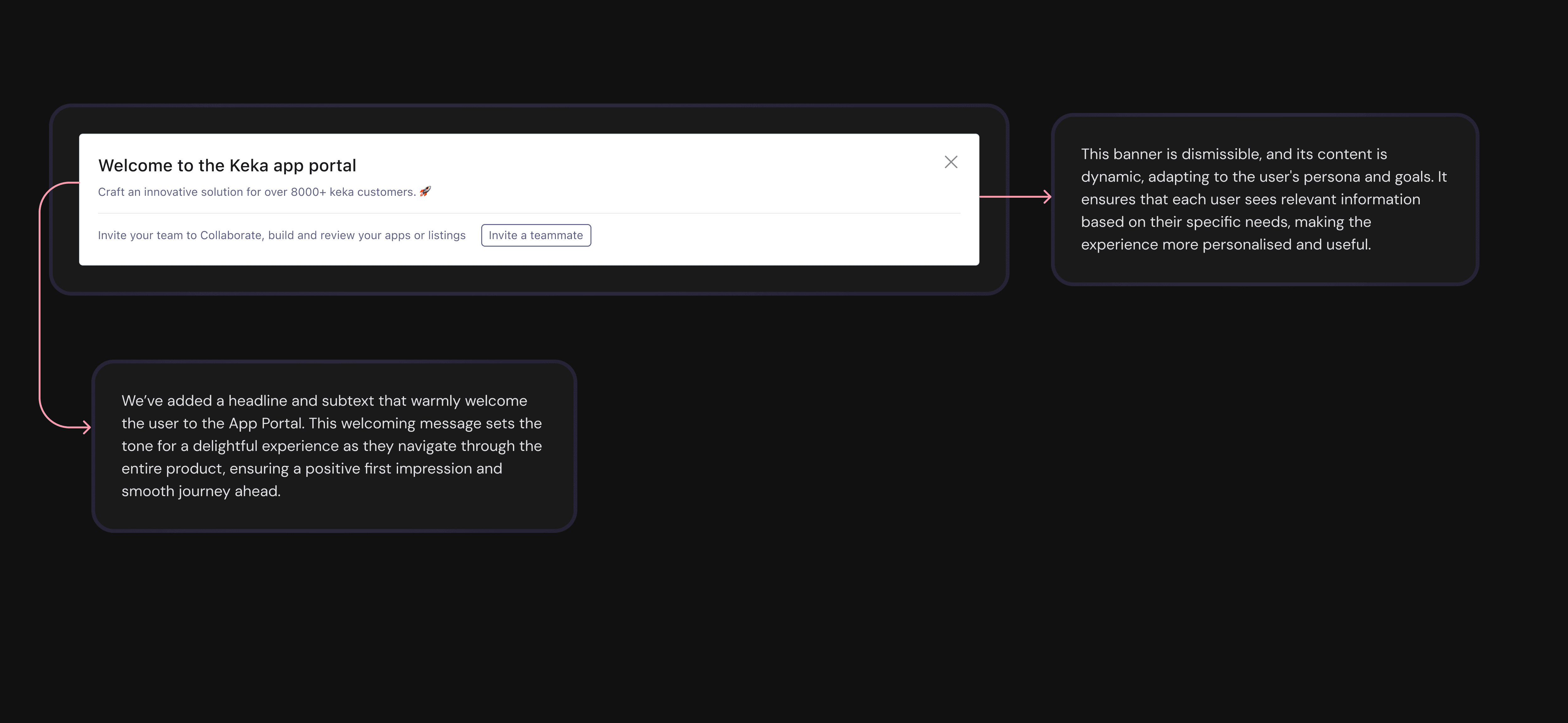
Welcoming Banner
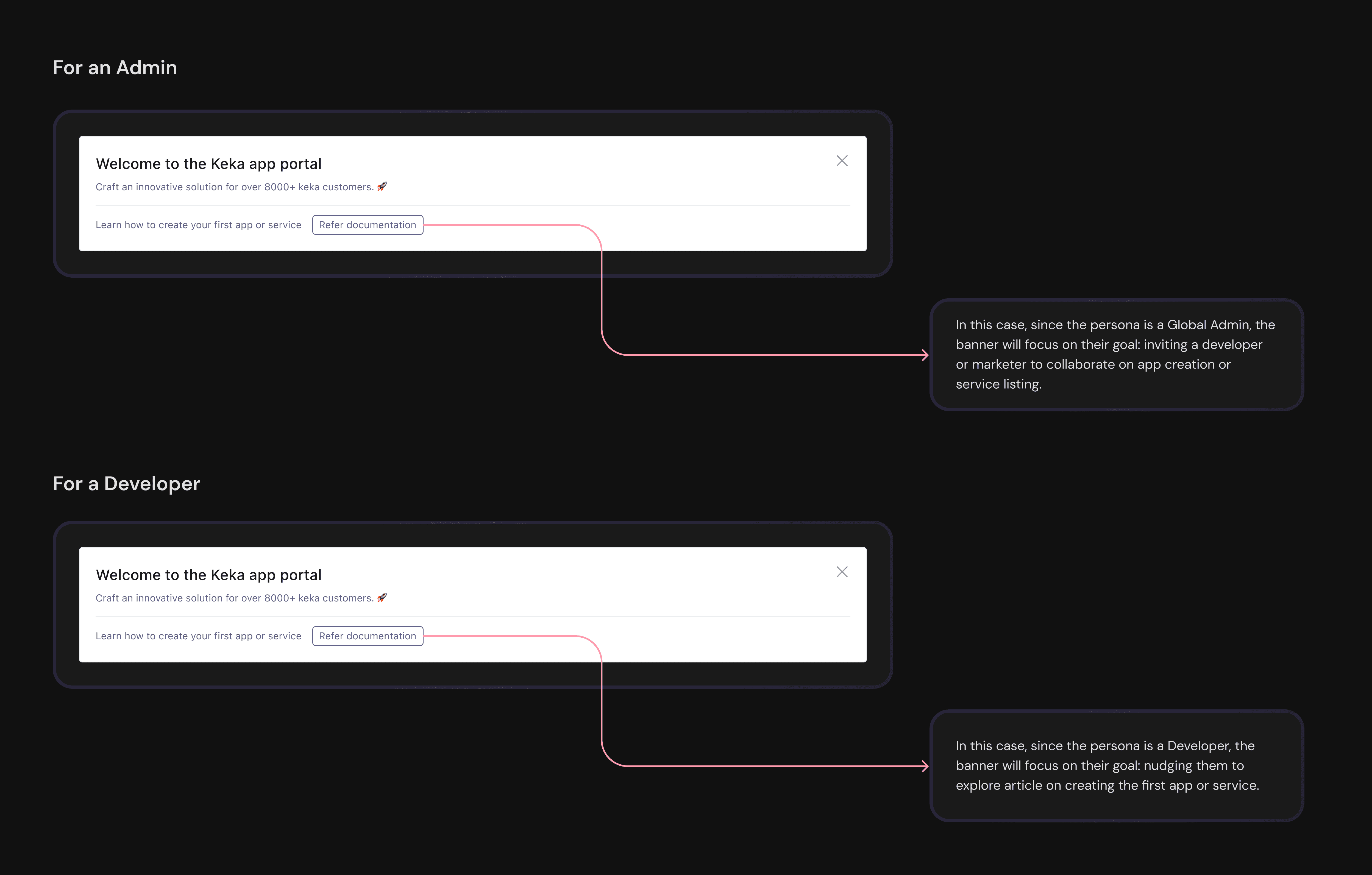
Personalised Banner for an Admin and a developer
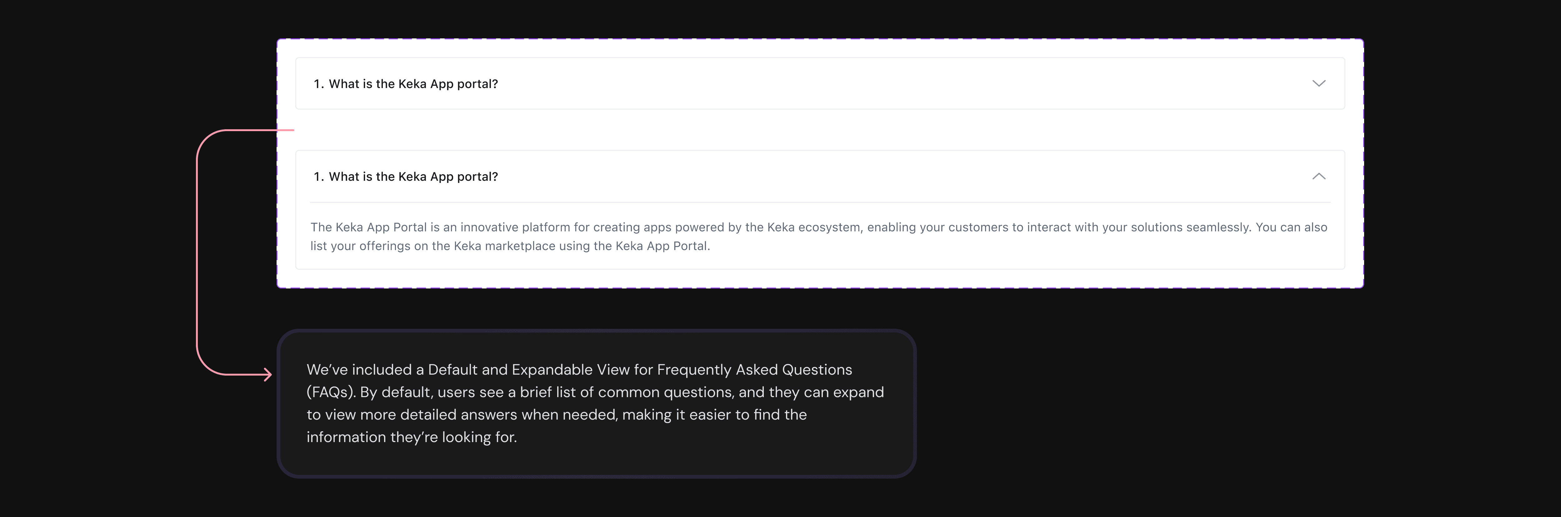
Apps/Services, Quick actions, and FAQs


Dev Hand-off and Review
Once we finalized the homepage design, we handed it off to the development team. They reviewed the design and provided their feedback. This time, the feedback was mostly positive, with just a few minor suggestions for improvement. We addressed all those changes asynchronously during the hand-off call. The design has now moved to the development phase, and we've recently rolled it out to users.
Impact

Thanks for watching 😀
🫣 how I designed App Portal experience from scratch

