A story on how we designed a scalable marketplace header component for 8500+ customers and 2M+ users at Keka
About Marketplace
The Keka Marketplace empowers over 10,000+ customers to discover a diverse range of apps across multiple categories. It offers apps that simplify daily workflows and enable seamless integration management—all within a unified platform “Keka Marketplace”. Keka Marketplace is built to boost users productivity and drive growth, which also helps partners engage with Keka customers and retain them through purpose-built integrations.
How it started?
It has been over 1.6+ years since I joined Marketplace and Integrations POD at Keka
Over the past few months, I had the opportunity to design one of the most complex components alongside Aditya, a design-focused Product Manager at Keka who initiated the discussion around this framework. This component will be used across multiple PODs and experienced by 8,500+ businesses and 2M+ users.
Designing this component was both challenging and rewarding. I learned a lot throughout the process and gained valuable insights into creating a scalable and flexible design system component.
In this case study, I’ll take you behind the scenes and share the journey of designing the App Card and App details header —from the thought process and key considerations to the steps we followed to bring it to life.
If you're working on a similar challenge, this might help you, too!
Here’s what we’ll explore:
What it’s like to design a card
Key things to consider
The step-by-step process
Let’s set go! 🚀
The Problem
Listing - The core of any marketplace
At first glance, a listing seems simple—a name, an image, a price, and maybe an action button. But dig a little deeper, and you’ll see how even this seemingly straightforward structure can get surprisingly complex.

👀 at this, you must be wondering,
It’s just 3 lines of text, I boxes and an image… What is so complicated about it?!
Thats a valid analysis, but for designers, things don’t end here. Every product, audience, and situation needs a different approach. A listing is more than just structure—it’s an opportunity to adapt, innovate, and create something that truly resonates. This needs to adapt and improve is what keeps design exciting and meaningful.

"We have redesigned the component to simplify and make information more clearer."
But, Why?
When we started off
We designed a component to effectively display relevant data based on user selection. Below are the components shown to users based on the listing type:
Service listing

App listing

Quick Explanation of App and service listing
App Listing: A type of listing where users can discover and install apps.
Service Listing: A type of listing where users can explore and avail services.
Everything was going good
Until…
The problem started when we tried to handle different use cases and scenarios. The component became too complex, creating visual clutter that might make it harder for users to make decisions and take action.
Phase 3

Use-case: When user has installed an app

Few use-cases as shown above:
When an app is private
Technical error during app installation
When an app connection is expiring in a few days
And more...
Along with this over the four quarters, we discovered 20+ new use cases across different PODS and customer / partner needs for an integration.
When we tried adding these new use cases to our existing design, it didn’t fit well. The structure wasn’t flexible enough to support every scenario, making it harder to maintain consistency.
This made us realise the need for a component redesign to make it more scalable, flexible, and
ready for future needs as well.
But, How might we design a scalable and flexible component that seamlessly adapts to current use cases and any future scenarios we may encounter?

Designing the component

To design a flexible and scalable card and header component, we took a different approach. Instead of making small changes, we built a framework that could handle all possible use cases users might encounter.
Before creating this framework, we analysed various B2B and B2C platforms to understand:
How they organise information.
Which details should be highlighted or de-priortised.
How these elements help users understand the context and make better decisions.
From this research, we gained valuable insights, which helped us build a strong foundation for our framework.
The framework for designing the component
List down all the available data points
01
Prioritise information based on the stage—Pre-installation or Post-installation
02
Order as per visual hierarchy, sizing and group similar data points using actual data
03
Map the data points as per design system and Add spacing and get into high fidelity
04
Try out variations, Iterate, and stress test
05
Stakeholder Feedback, Design the component and maintain separate file
06
The Process we followed

Structure of a Listing component
Logo
Headline
Tagline
Contacted / Contact
Installed
Manage
Configure
Open app
Connection details:
Single accounts connected
List of accounts connected
Private App
Alert Bars
Published by
Reviews and Ratings (optional)
Keka Choice (optional)
Pro / Free (Marketplace plus)
Trending (may or may not be visually seen) (optional)
Now, we have data points to be taken care while designing a header component
Next step we have done is to segregate the stage into two types: Pre-install and Post-install
we have listed down the data points as per the data points
Stage of a header component and Order as per visual hierarchy
Logo
Headline
Tagline
Contact
Install
Keka Choice (optional)
Trending (may or may not be visually seen) (optional)
Pro / Free (Marketplace plus)
Reviews and Ratings (optional)
Published by
Logo
Headline
CTA
Manage
Open and Manage
Configure
Re-install
View connections
Status:
Connected
View Connections
Single accounts connected
List of accounts connected
Installed
Alert Bars
Private App
Tagline
Published by
Reviews and Ratings (optional)
Marketing / Pricing tags
Keka Choice (optional)
Pro / Free (Marketplace plus)
Trending (may or may not be visually seen) (optional)
After a detailed internal discussion, we have finalised the arrangement of data points as per the visual hierarchy. Next thing we have tried to arrange it as per the sizing so, far we didn't follow the design system properties. All we did is focusing only on hirearchy.

Getting into Visuals
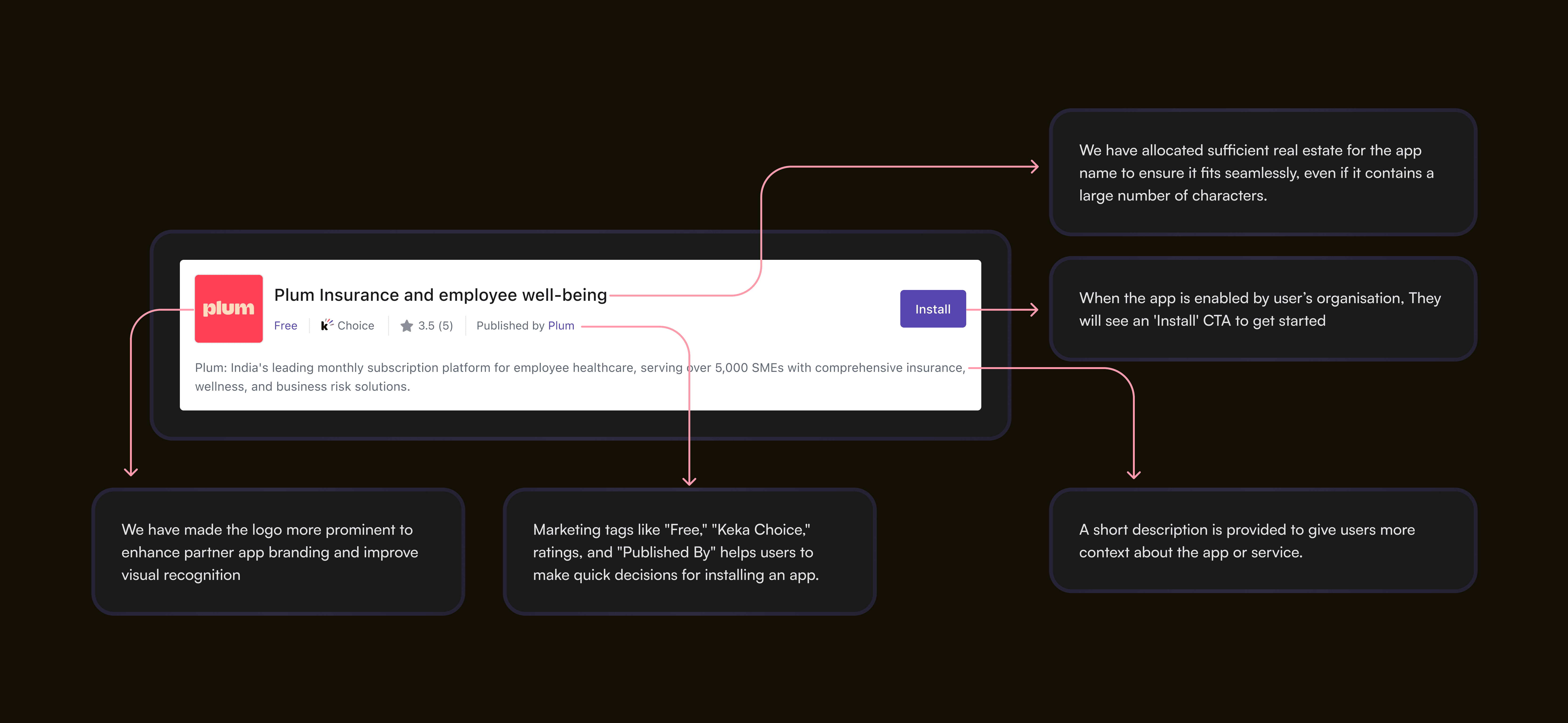
Once we have finalised the base component for both the Pre/Post installation stages, we also evaluated its visual hierarchy to ensure that the prominent elements received enough attention. According to our framework, the logo, app name, and call-to-action require the most focus.
Visual hierarchy Check
Once we have finalised the base component for both the Pre/Post installation stages, we also evaluated its visual hierarchy to ensure that the prominent elements received enough attention. According to our framework, the logo, app name, and call-to-action require the most focus. From this experiment, we concluded that the component performing well in terms of visual hierarchy.

Thanks to @Ekta for suggesting this for the hierarchy check! Really appreciate it. 😊
Stress-testing the component
After completing the entire process of designing the header component using the framework, and stress-testing the component by placing it the actual screens. We have finally presented it to our Leadership, Product, and Engineering teams. We received positive feedback on both the framework creation and the design process of the component.

We have placed the component inside the actual screen to see how it is aligned with the overall layout. Overall, it did align well, just a few minor tweaks we have made to the component and it worked well!
Presenting the header component


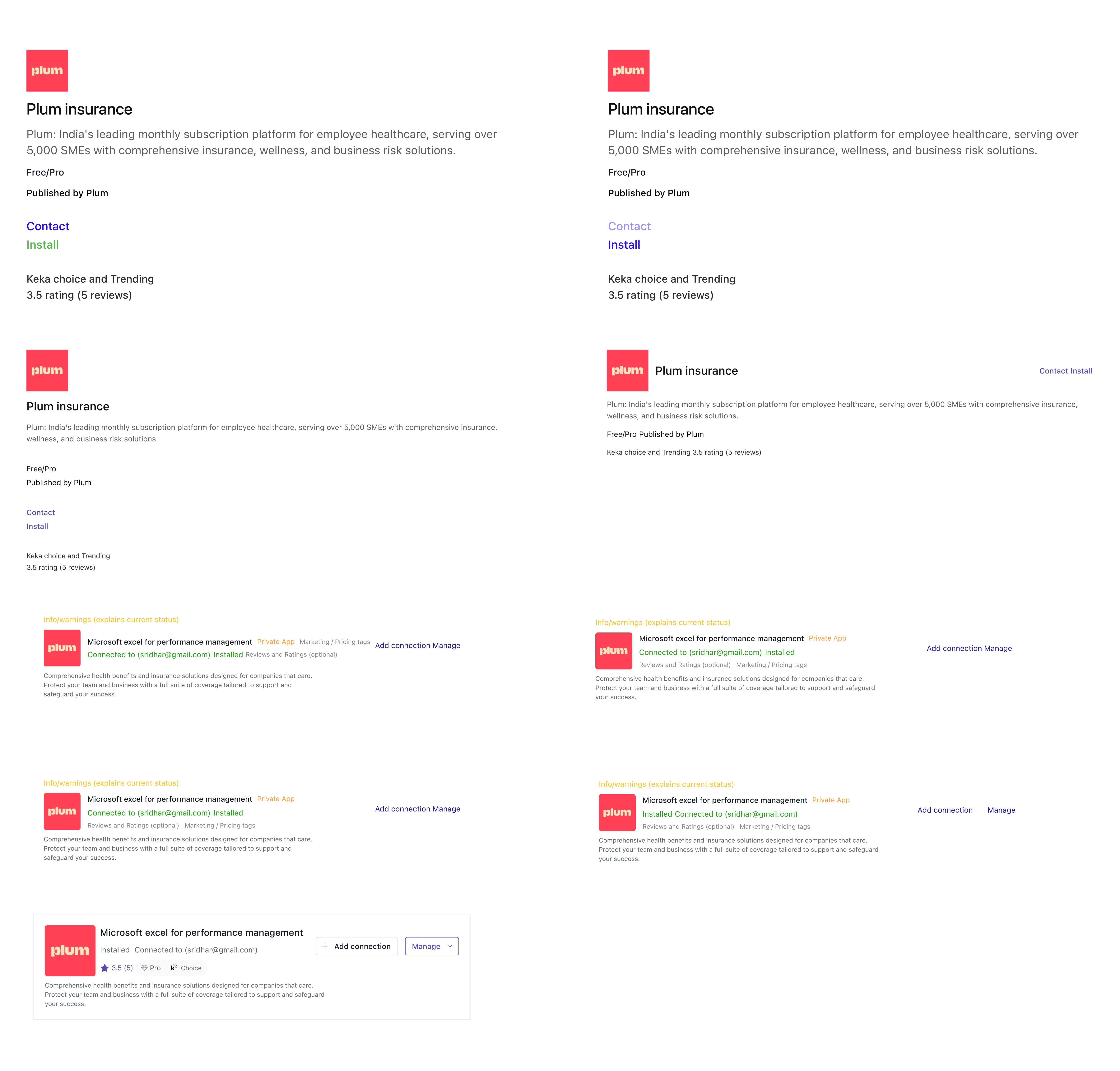
Creating the Variants:
We designed multiple variants of the component to handle different use cases and scenarios, ensuring flexibility and consistency across the product. Each variant adapts to specific needs— whether it’s displaying error messages, warnings, or success confirmations—while maintaining a cohesive visual language. By standardizing elements like color, typography, and iconography, we created a scalable system that enhances usability and ensures a seamless user experience across different contexts.

Base component
Default component and properties for Pre-installation stage

Default component and properties for Post-installation stage

My thought process behind designing the pre-installation header component focuses on creating a clear and engaging experience. It ensures users can quickly understand the app's purpose, recognise branding elements, and access key actions seamlessly.
Designing the post-installation component was challenging as it has more than 20+ use cases and multiple states. I spent lot of time designing this component to ensure it works smoothly in all scenarios. Adding properties was also challenging, but after connecting with designers and Product and engineer folks we simplified the component to ensure that any POD can work on it seamlessly.

Error and warning alerts were designed to provide clear context across different scenarios, including technical issues, authorization errors, and external dependencies. Each alert communicates the problem using concise, user-friendly language, helping users understand what went wrong and how to resolve it.
From a UX standpoint, we used distinct visual cues—such as color coding (red for errors, yellow for warnings), icons, and clear headings—to differentiate the severity of alerts. Where possible, actionable steps, links to support, or retry options were provided, ensuring users could quickly address issues without unnecessary frustration.

Dev Review and initial hand-off
Once the component had been designed, another cycle of dev review happened. Developers went through the component design and gave their feedback. Most of the feedbacks were resolved async but if some major feedbacks were discussed and closed on a review call. Once everything was good to go, the component moved to the development phase.

Final Dev hand-off and documentation:
To ensure a smooth development process, we provided comprehensive documentation alongside the component designs. This included detailed specs, usage guidelines, and edge cases for each variant, ensuring clarity on functionality and behavior. Interactive prototypes and code snippets were shared to bridge the gap between design and implementation.

My Learnings